
Build a Clear Visual Hierarchy for Customer Account Pages
A clear account page helps a customer distinguish information from actions.

A clear account page helps a customer distinguish information from actions. When every card, badge and number receives the same emphasis, important next steps become harder to find. Review the page around the questions customers need answered rather than adding decoration to every available space.
Identify the primary question
Decide what the customer needs to understand first on this page. It might be the account context, a selected service or the current record state. Keep unrelated promotional text from competing with that information. The hierarchy should serve the task rather than reflect the number of features available.
Separate actions from summaries
Make it clear which element changes something and which simply displays a value. Avoid making a decorative card resemble an actionable control if it has no purpose. Keep financial or order-changing actions recognizable and supported by their relevant context, rather than hiding them among similarly styled labels.

Use emphasis selectively
Reserve stronger visual treatment for a meaningful priority. Do not rely on color alone to explain a critical state. Preserve readable text contrast and useful spacing on narrow screens. A compact design can remain clear without making every element tiny or removing the explanation behind a value.
Review alternate states
Check the page when there are no records, when a name is long and when a message needs attention. A design based only on a full happy-path example can leave ordinary states confusing. Record what was reviewed and keep the theme changes scoped to the intended website.
Quick review checklist
- Identify the page’s main customer question.
- Separate controls from displayed values.
- Review empty and attention-needed states.
A practical question
Should every value be highlighted equally?
No. Use emphasis to support the task and preserve meaningful differences.
Continue with PechPanel
Review the current platform features, setup overview and plan information. For an account-specific question, sign in and open a support ticket with the relevant non-secret reference. Follow the applicable service conditions and social platform rules; these guides do not guarantee business results, audience growth or search rankings.
Related guides
- Keep Public Service Information Consistent Across Your Panel
- Keep a Multi-Panel Overview Useful Without Mixing Records
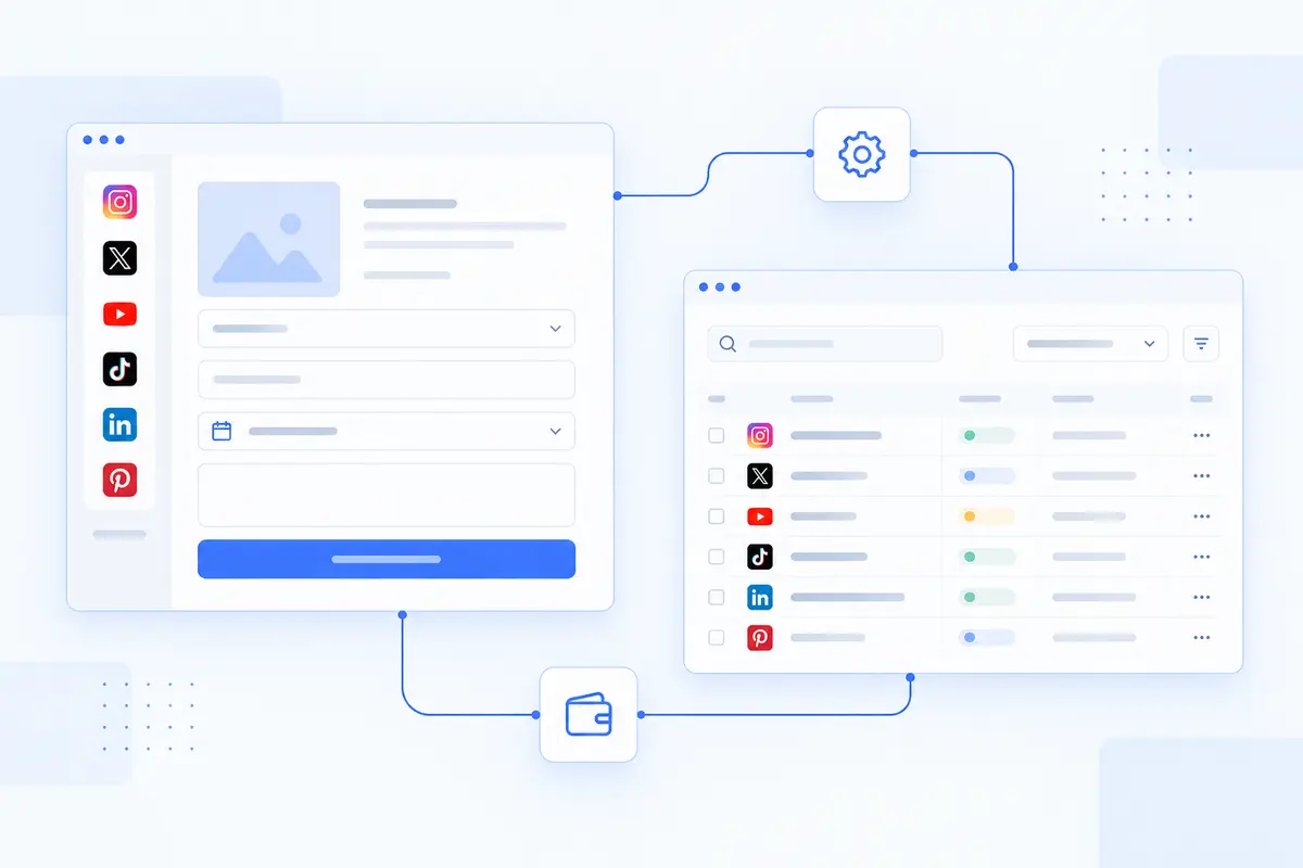
Images are reused AI-generated conceptual illustrations, not actual customer account screenshots or proof of performance.